 |
| Tweet |
Stocks go down faster than they go up and tops are not always a process as many may claim.
The eagle-eyed investor knows that it's never too early to start looking for signs of trouble within a stock's uptrend.
Sometimes all you need to notice is one flaw in a stock's behavior before it breaks down through support.
A close below the 10 Week Moving Average (MA) on heavy volume is one of the most common warning signs that precedes major tops in stocks.
But did you know that there are other negative behaviors that you can find before a stock breaks its 10 Week MA?
Here are five (5) weekly warning signs to identify before a stock breaks its 10 Week MA:
1. First Swing Point High (fSPH)
A swing point high is a price behavior that indicates a potential change in direction.
This change can develop as an overdue consolidation or a major top for a stock that's been moving higher.
However, if a swing point high occurs in an extended stock for the first time since it left its base, watch for a top to form.
A swing point high consists of three (3) price bars:
- Lower high #1
- Higher high (Highest high)
- Lower high #2
But that's not it.
A swing point high also needs confirmation.
To confirm a swing point high, Lower high #2 must close below the lowest price of the highest high.
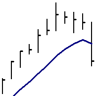
Please look at this chart to see a swing point high:
|
Click to enlarge |

There's one important point that I need to clarify before you get to my first historical example.
If you'll remember, I said that a "swing point high consists of three (3) price bars"
Well, that's not always true.
Sometimes a swing point high includes more than three price bars.
How can this be?
Please let me explain.
The most important part of a swing point high is the second "lower high" that closes below the lowest price of the highest high.
As I mentioned, this is what confirms the swing point high.
Without a close below the lowest price of the highest high, there's no confirmed swing point high.
Here's the key point...
The close below the lowest price of the highest high does not have to come immediately after the high.
It can come two, three or more weeks later.
The only requirement is that price doesn't make a higher high before it confirms the swing point.
You will see an example of this delayed confirmation when you get to my example that's on the next page.
5 Weekly Warning Signs Before a Stock Breaks its 10 Week MA
Note: This article is meant to help you learn from the market and does not serve as investment advice for any specific group or individual. For more information, please read the HSR Terms of Use.
Historical Stock Chart Examples 1A & 1B (First Swing Point High): InfoSpace.com (INSP) 2000
InfoSpace.com was one of the technology stock leaders that garnered a lot of attention during the Nasdaq's parabolic rise into its March 2000 Top.
INSP broke out of a 6-month base in November 1999 and advanced 600% before confirming a First Swing Point High (fSPH) in March 2000 (see chart 1A).
It was InfoSpace's first swing point high since July '99.
That's nearly eight months and an important change of character.
But there was more trouble brewing for the high-flying Internet stock.
The following week, INSP closed below its 10 Week MA for the first time since mid October 1999 (see chart 1A).
The break of the 10 Week MA marked the beginning of the end for InfoSpace.com (see chart 1B).
By 2002, Infospace.com had fallen 99% from its March 2000 high.
As an aside, a month before it topped, Infospace's Founder came out and said that InfoSpace.com would be a bigger company than Microsoft (MSFT).
At the time, InfoSpace.com had total revenues of less than $50 million vs. Microsoft's $20 billion.
InfoSpace.com never became a bigger company than Microsoft and now trades on the market as Blucora (BCOR).
|
Click to enlarge 1A |
Click to enlarge 1B |


2. Inside Bar
An inside bar forms when a stock's price range (high and low) is contained within or "inside" the prior week's price range.
It's a common technical signal, but when an inside bar surfaces in an overly extended stock, it can serve as a warning that upward momentum has stalled.
In extended stocks, inside bars will often appear after a stock has gone on a streak of higher highs and higher lows.
This subtle change in a stock's character is a small, but important detail because price failed to make a higher high for the first time in many weeks.
As a result, the inside bar breaks a stock's bullish rhythm, which may lead to a chain of events that causes a stock to drop.
Historical Stock Chart Examples 2A & 2B (Inside Bar): Sina Corporation (SINA) 2011
Sina (SINA) was a stock that broke out during the late 2010 Market Uptrend.
After advancing over 100% in 23 weeks, SINA took off and almost doubled in only 8 weeks.
At the end of this furious sprint, SINA printed an inside bar for the week ending 04/29/11 (see chart 2A).
The inside bar came after seven consecutive higher highs and higher lows.
Although the inside bar closed higher for the week, it was the first week in 9 weeks that price failed to make a higher high.
The following week, SINA made its first lower low in 2 months (see chart 2B).
This hinted that the prior week's inside bar might have kicked off the start of a change in trend.
If that didn't convince you that SINA was vulnerable, the following week's high volume break of the 10 Week MA should've gotten your attention (see chart 2B).
The decline was SINA's heaviest volume week of its entire uptrend, a bearish sign.
The chain of events following the inside bar signal turned out to be significant as SINA topped and rolled over (see chart 2B).
|
Click to enlarge 2A |
Click to enlarge 2B |


5 Weekly Warning Signs Before a Stock Breaks its 10 Week MA
Note: This article is meant to help you learn from the market and does not serve as investment advice for any specific group or individual. For more information, please read the HSR Terms of Use.
3. Price Churn
Price churn occurs when a stock fails to make upward price progress on heavy volume.
In other words, there's a lot of effort (volume), but very little results (range expansion) to show for it.
Churning can surface at any time, but when it shows up after an advance, it's a sign that institutional investors are using the mark up in shares to sell into strength.
Remember, stocks tend to come under distribution while they're advancing.
I like to call this distribution on the advance.
Why does this happen?
Let me quickly explain.
Institutional investors prefer liquidity to sell their stock holdings and there's no better time to sell then when everyone else is buying.
Uptrends provide the perfect opportunity to unload stock to investors who want in on a stock that they may have missed at the beginning of the rally.
Do you now understand why stocks come under distribution while they are moving higher?
Let me show you an example of this on a chart.
Historical Stock Chart Examples 3A & 3B (Price Churn): Diana Shipping (DSX) 2007
Diana Shipping (DSX) benefited from increased global commodity demand during the latter part of the 2003-2007 Bull Market.
Along with its peers, DryShips (DRYS) and Excel Maritime Carriers (EXM), DSX racked up large gains in a relatively short period of time.
But as we know, all good things must come to an end and DSX was no exception.
For the week ending 11/02/07, DSX closed up 1.9%, but it was on the heaviest volume of its brief, 2+ year trading history (see chart 3A).
That price action showed classic churning behavior because a lot of volume went into lifting the stock higher, but the end result (% gain and range expansion) didn't quite match the effort.
The next week, DSX reversed course and began falling hard (see chart 3B).
DSX would never surpass its 11/02/07 churning week high.
|
Click to enlarge 3A |
Click to enlarge 3B |


4. Contracting Range
Contracting range is easy to spot on a bar chart.
In uptrends, it occurs when volume soars and prince range narrows or shrinks.
Like price churn, the heavy volume in contracting range indicates that price is laboring.
However, there is one important difference between price churn and contracting range weeks.
In contracting range weeks, the percentage gain for the week can sometimes look impressive, but relative to the volume it's not positive.
In extended stocks, an increase in volume should come with range expansion, otherwise, there's distribution going on behind the scenes.
Can you see how both price churn and contracting range weeks can hide distribution if you don't use a stock chart?
5 Weekly Warning Signs Before a Stock Breaks its 10 Week MA
Note: This article is meant to help you learn from the market and does not serve as investment advice for any specific group or individual. For more information, please read the HSR Terms of Use.
Historical Stock Chart Examples 4A & 4B (Contracting Range): Federal Express (FDX) 1980
Federal Express doubled shortly after breaking out of its first base since it went public.
However, for the week ending 02/01/80, FDX printed a contracting range week (see chart 4A).
During its contracting range week, FedEx closed up, but volume soared and its price range barely budged.
After its extended advance, the contracting range week was a warning that sellers were using the rally to unload FDX stock.
Five weeks later, FDX broke its 10 Week MA and fell 40% from its early February peak until it bottomed in May 1980 (see chart 4B).
In contrast to the other historical examples (INSP, SINA, DSX), not all distribution/change in direction behaviors lead to catastrophic declines.
Sometimes a warning sign such as a contracting range week will give you a heads up on an overdue basing period that lies ahead.
For FDX, that was indeed the case as it eventually gathered itself and broke out again during the market's 1980 Uptrend (see chart 4B).
Click to enlarge 4A Click to enlarge 4B


5. Heavy Volume Off High
Heavy volume coming off a high is a warning signal that occurs when an extended stock makes a new weekly high and then on the following week, makes an equal or a lower high on the heaviest volume of its entire uptrend.
To be clear, volume may be the heaviest in its history or the heaviest since it last left a base.
Historical Stock Chart Examples 5A & 5B (Heavy Volume Off High): CREE (CREE) 2010
CREE was one of the early stock leaders that powered the 2009 Market Uptrend.
CREE broke out of its first base in July 2009 and along its peers, VECO and AIXG, led a powerful group move in companies involved in LED (Light Emitting Diode) Technology.
However, in late April 2010, signs of trouble emerged for CREE.
For the week ending April 23, 2010, CREE came off a 10-year high on the heaviest volume in over 5 years (see chart 5A).
That qualified as a Heavy Volume Off High Week and marked the start of CREE's descent back to earth.
By July 2011, CREE had given back just about all of its gains since its 2008 bottom (see chart 5B).
|
Click to enlarge 5A |
Click to enlarge 5B |


In summary, there are many price behaviors that indicate a stock might be in trouble before it breaks its 10 Week Moving Average.
Some of these include:
- First Swing Point High (fSPH)
- Inside Bar
- Price Churn
- Contracting Range
- Heavy Volume Off High
A decline may ensue after one of these behaviors or price may be getting ready to reverse in the near future.
To best notice these behaviors, using a chart and paying attention to detail is necessary because you will have to listen to the market.